Redesigning an AI research platform. Synthetic Users.
First dedicated product designer. Redesigned the core platform and built a scalable design system.
Year
2026
Duration
Two months
Tools
Figma
V0
Miro
Team
1 Designer
1 UX Researcher
1 Front-end Dev.
Context & Challenge
Synthetic Users is an AI platform that lets teams run user interviews with synthetic participants. Enterprise clients like JP Morgan use it to validate ideas at scale.
I joined as the company's first dedicated designer. The product had been built without design support, no Figma files, no design system, and an interface that had accumulated usability issues as the product grew.
Three core problems:
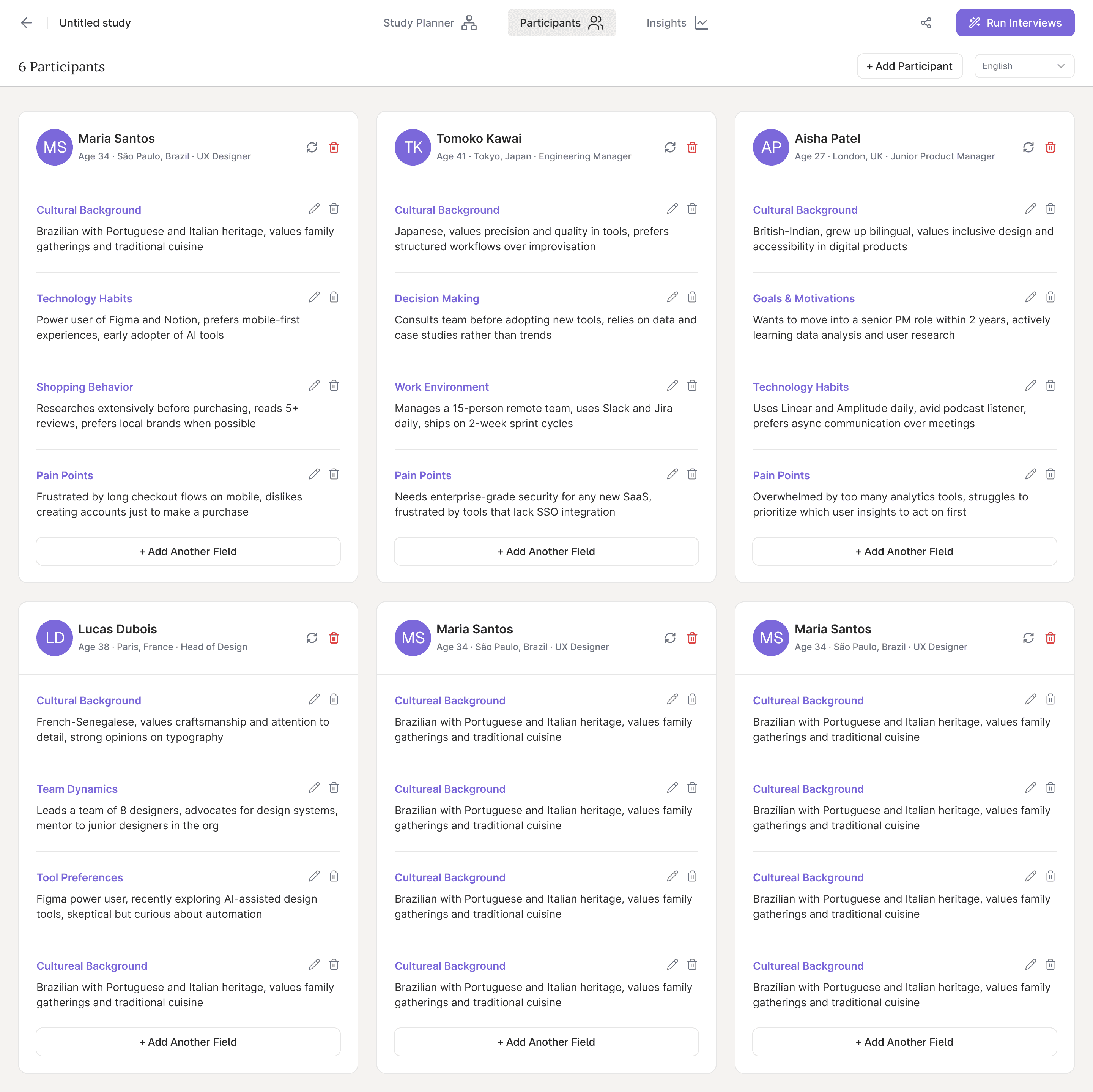
Study creation was confusing
Users struggled with a rigid, unclear flow that didn't match how they actually worked.
No design system
Shadcn was used on the frontend, but with no design layer. No shared language between design and development.
Navigation and IA issues
Analytics and team interviews revealed users getting lost, not finding studies, and confusion around research modes.
Research → Prototype → Test → Build
I partnered with the team's researcher to run a heuristic evaluation, reviewed analytics, spoke with engineering and sales, and interviewed active users. This gave us confidence we were solving the right problems.
I then skipped wireframing and went straight to prototyping some concepts with V0. A working prototype in a single day, instead of prototyping wireframes in Figma. Our team was poking holes in a real flow within hours. We tested internally, then with users, and iterated until the design was solid.
Give people ingredients, not recipes
Users weren't asking for a simpler flow, they wanted more control. Most were using the same building blocks but combining them in different ways. The old design assumed we knew how people wanted to research. The new design gives them the ingredients and lets them cook.
Goal
Concept
Participants
Goal
Test
Context
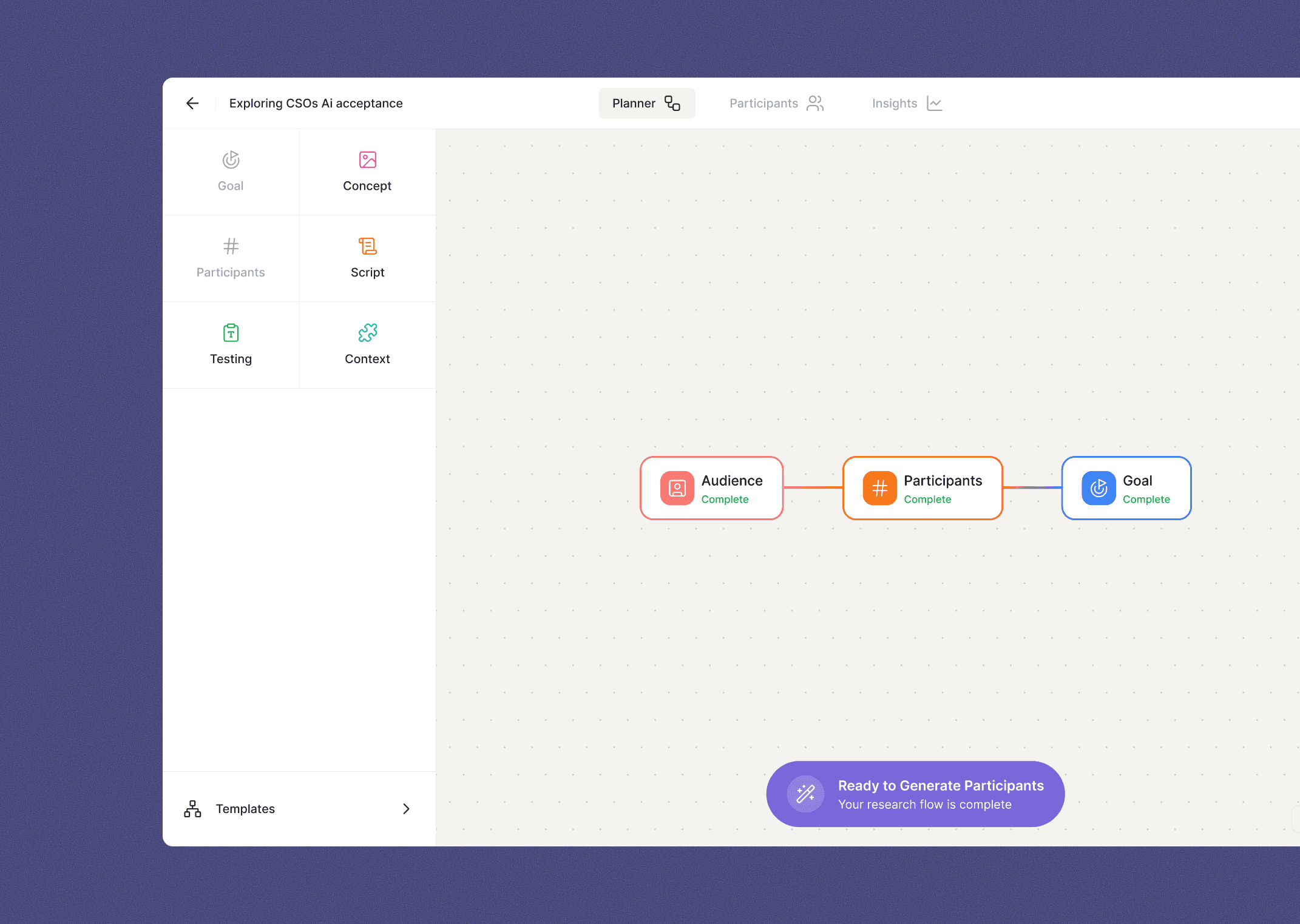
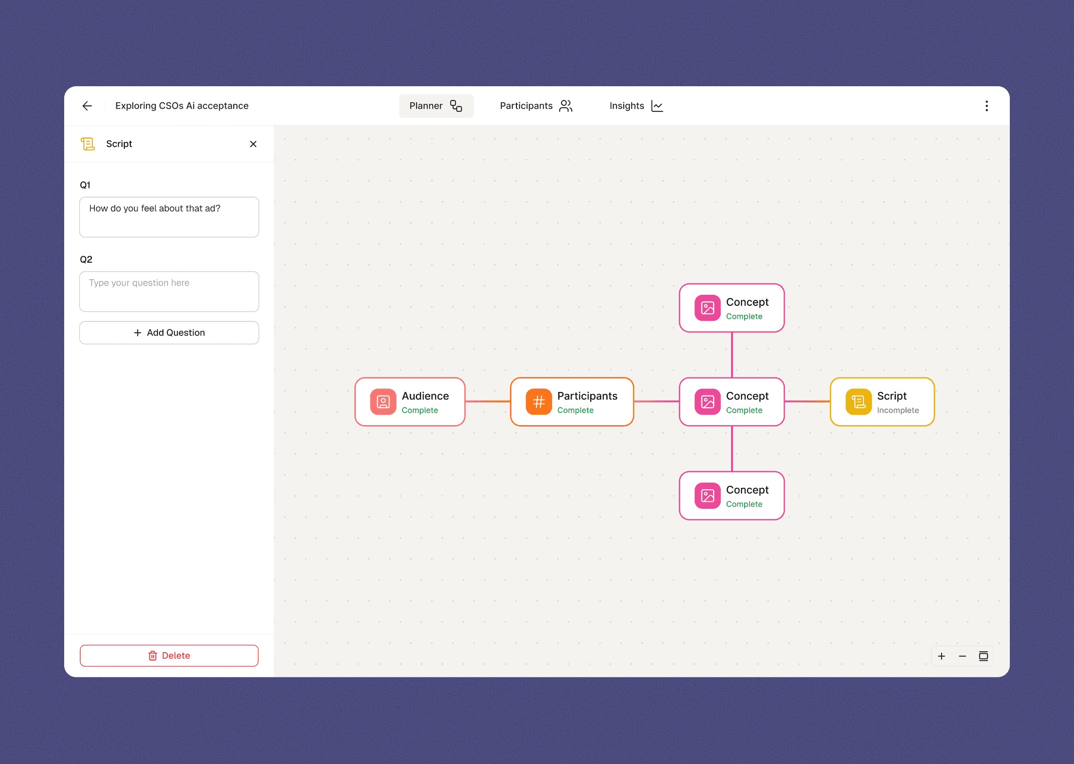
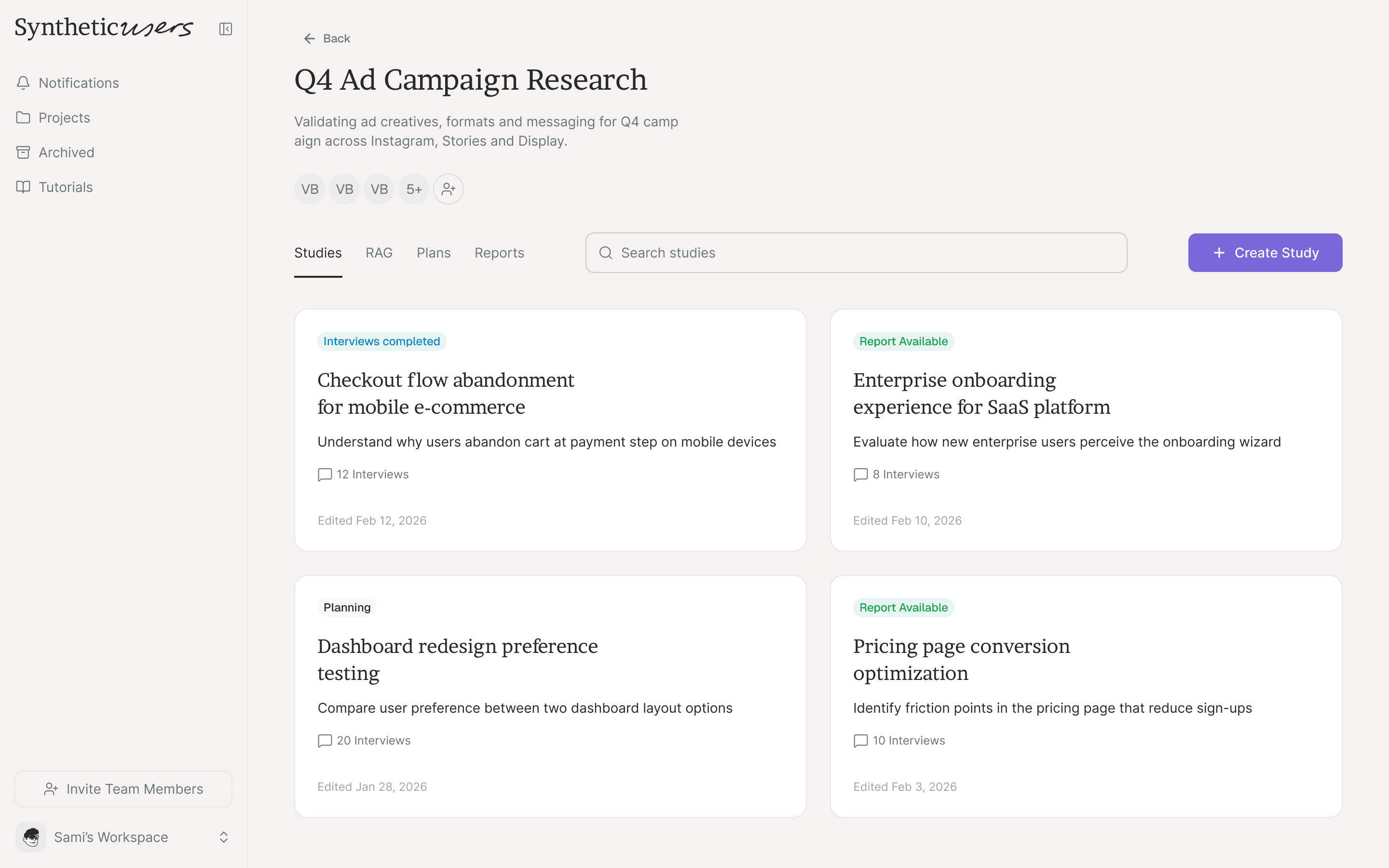
Study planner
We replaced the step-by-step wizard with an open canvas where users compose studies from modular blocks: Audience, Goal, Script, Testing material, Context, and Participants. Each block opens a sidebar panel for detailed configuration. Nothing mandatory, nothing locked to a fixed order.
Modular, not linear
Same ingredients, different recipes. A concept test and a discovery interview use the same components, configured differently.
Sidebar-driven configuration
Keeps the canvas clean while giving each element depth.
Status at a glance
Blocks show their state (starting, ongoing, ready) so users always know where things stand.
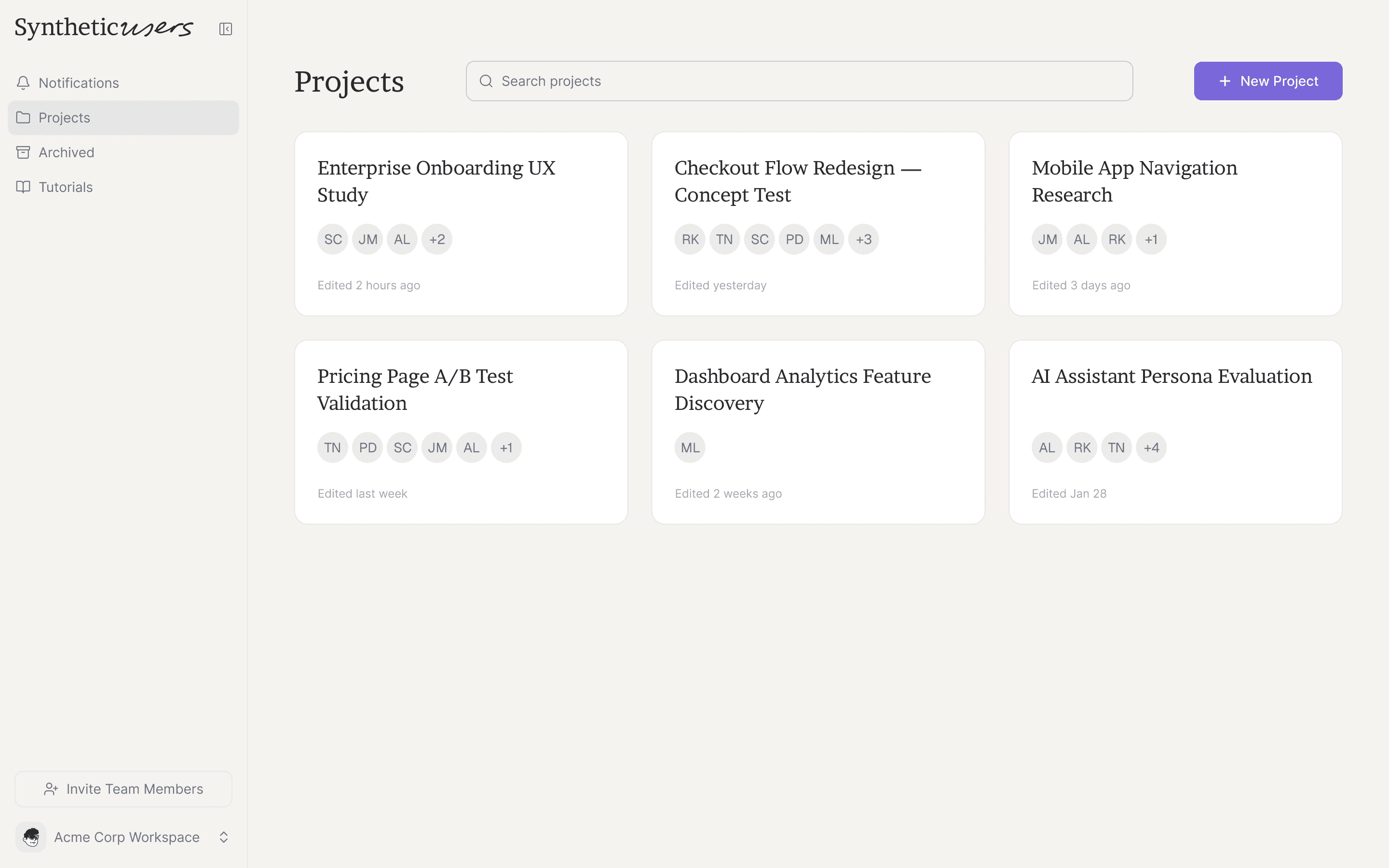
Design system
The team already used shadcn/ui, so I proposed buying a Figma shadcn library and theming it to match the brand. I updated all variables, colors, spacing, typography, border radius, to match the code exactly, working closely with the frontend developer to ensure 1:1 alignment.
With the system in place, I built the final screens in Figma using the V0 prototype as a guide, designing for edge cases and refining the details
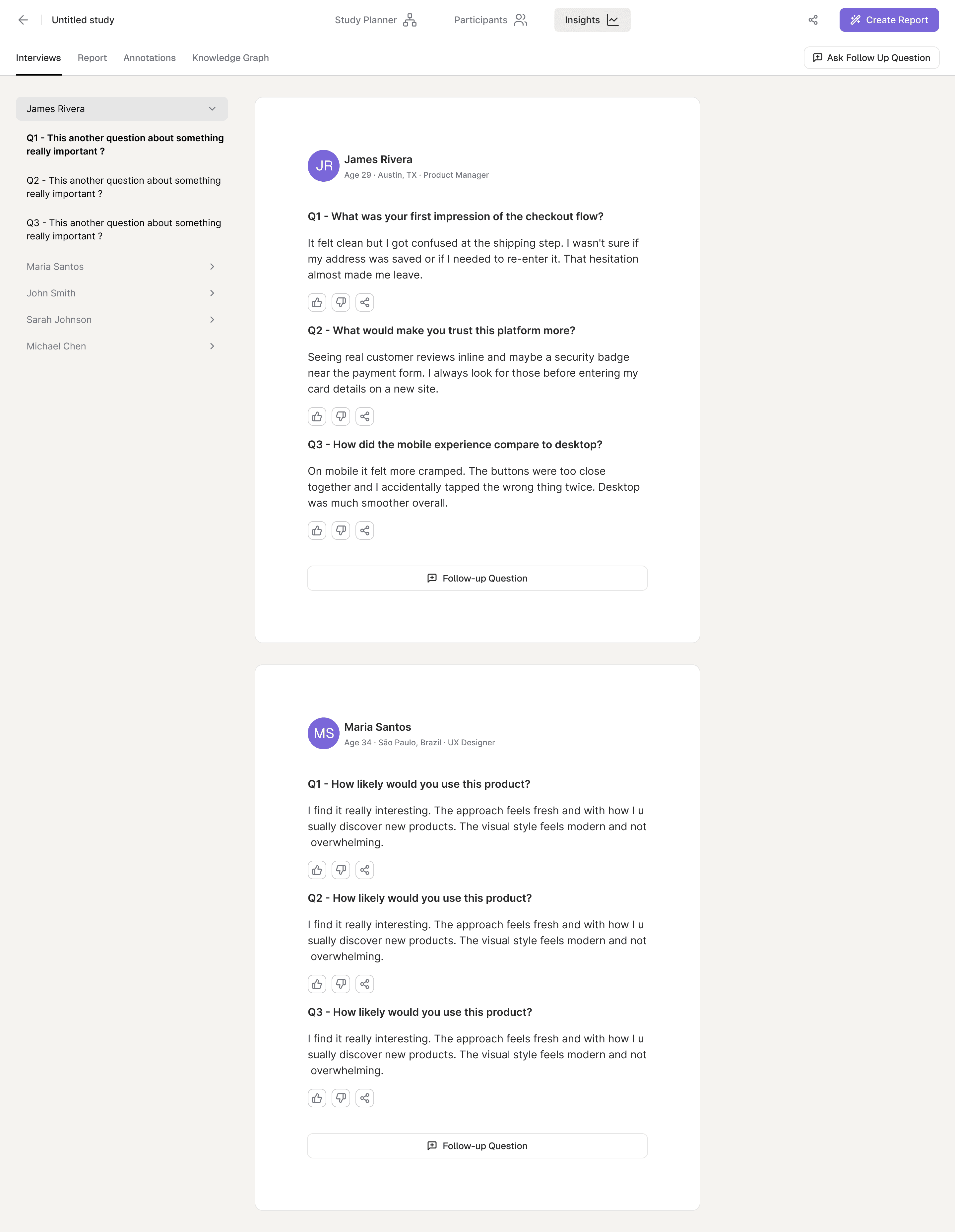
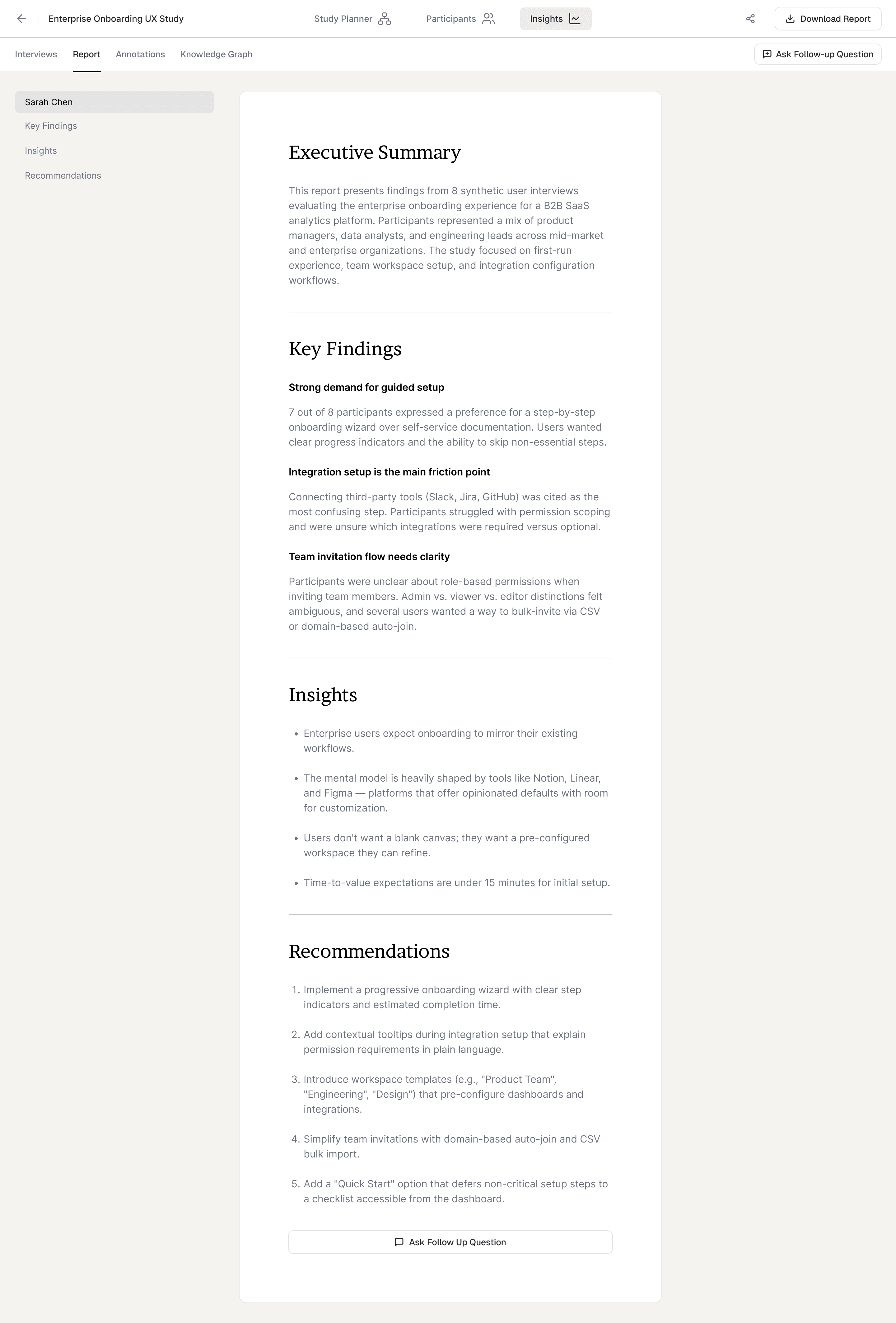
Impact
The redesign is currently in staged rollout.
Study creation
Users moved from following a prescribed flow to composing research their own way. Early testing showed noticeably more confidence during study creation. We're tracking completion rates and time-to-first-study as the rollout continues.
Design system
Matching Figma 1:1 to the shadcn codebase meant the frontend developer could build directly from specs. Less back-and-forth, faster delivery. Shipping velocity is the metric we're watching as the team keeps building on top of it.
Navigation
The clearest signal came from the people closest to customers. The sales team is seeing stronger engagement during demos. Customer success is receiving better feedback from clients. Both teams feel more confident and proud of the product during sessions. We're tracking feature discovery and support queries as rollout scales.
Reflection
Research before redesign
The heuristic evaluation and user conversations gave us confidence to make bold changes and evidence to defend them.
Speed over perfection early on
V0 let us test ideas in hours instead of weeks. A clickable prototype beats static screens every time.
Design systems are a team sport
A Figma file that doesn't match the codebase is decoration, not infrastructure.
Being the first designer is a design problem itself
Part of the job is introducing process, creating shared artifacts, and building trust in what design can do.